Building a home network Observability stack with Telegraf and InfluxDB
Life Before Datadog and New Relic

Life Before Datadog and New Relic
In the mid 2010s, I mostly worked on small infrastructure teams where we didn’t have the budget for SaaS tools. Or I didn’t try to get it. We felt lucky to have PagerDuty. Well, as much as one can ever like having PagerDuty.
APM was scarce and expensive. I know, because I did the expense reports each month, billing them to my personal credit card. In one of these environments, we’d rotate a handful of New Relic licenses to specific application servers to gain insight into the database queries and application performance when we needed them. And that was close to 500 bucks.
In general, but we relied exclusively on Open Source tech for metrics and alerting.
Besides, we had the capacity to support and maintain Open Source monitoring solutions ourselves. We got good enough at it, and it mostly worked. Well some of it, because I don’t know how many teams I joined had that one poorly maintained Nagios server, but it was definitely a thing in the 2010s.
Alerts flapping, spamming your inbox, and God help you if didn’t have it have Nagios tuned properly if you ever decided to wire it up to PagerDuty!
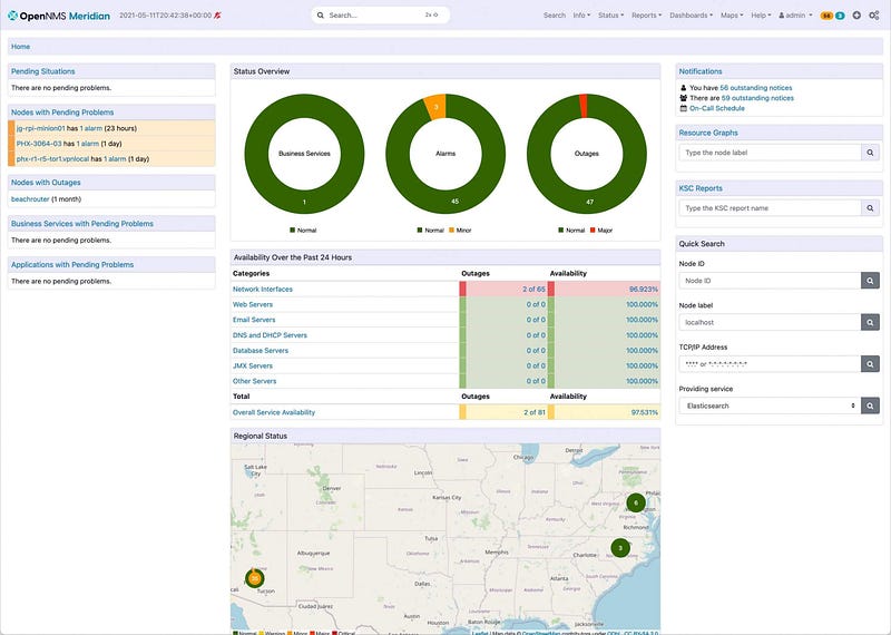
Somewhere along the way, I learned about OpenNMS and always loved how it would discover new services. Once you got it set up, it just worked. Yes is was XML and Java hell but if you kept increasing the cores and memory it would generally scale well. For small, relatively static environments up to a thousand nodes, it was perfect. Autoscaling was for Netflix.
I even wrote super-hacky cronjob Python integration for PagerDuty that directly queried the Postgres Database and and auto-resolved alerts. That was the world before Docker and Kubernetes. Pets all around. Long-running EC2 instances (or VMs) that you spun up somehow, managed with Ansible and upgraded in place–if you patched at all.
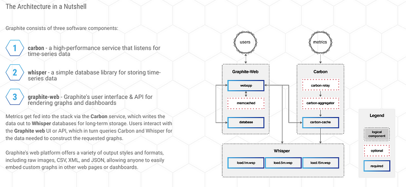
Around this time, I first fell in love with Graphite — and metrics in general. This was after dipping my toes into the problem space when I was responsible for a few hundred BSD firewalls in the lates 2000s when I worked at Hewitt. That was when I learned about Ganglia and RRD metrics and wrote some terrible Ruby scripts that collected PF stats from BSD, but I digress.
When I first discovered that ugly blue Graphite dashboard, it was amazing!
It was so cool to see data points start to show on a graph like stars coming out at night, one by one. You didn’t have to refresh your brower, even. This was such an improvement over the RRD-based tools over the late 2000s that had their origin in network management and required the image to be regenerated on the backend. I remember squinting at stupid graphs for each BSD box and the pre-generated graphs and there was no way to build any custom dashboard in the UI.
However, once you got into 500–750 nodes you had to scale out your monitoring infrastructure. High availability, Carbon nodes behind ELBs, and go multi-region. All that fun. One of the best engineers I’ve ever worked with proved himself by building a solid, scalable Graphite backend that we eventually added to Grafana. At some point Grafana came onto the scene.
We got OS metrics with Collectd, we pulled JMX metrics from our ElasticSearch clusters and Scala services with jmxtrans and developers added custom metrics that we could gain end to end visibility into ingestion pipeline. If dealing with scalability issues (and outages) is ever fun, this was the time. Teams talked about data and had a shared understanding–or found proof in graphs when they didn’t. They shared links in email. This is long before dashboard/metrics as code we even a consideration.
I remember debates about “push” vs. “pull” monitoring. Based on the experience of Statsd/Collectd/Graphite I always preferred “push” because there was less to configure on the head-end. Ensure your collector points at the write metrics endpoint and let the backend to the rest.
By late 2017, most teams where I worked had switched to DataDog or New Relic. Either we had the budget (although dealing with SaaS costs is always a challenge) or it came out of another team’s budget and we didn’t have to worry about it so much. Install the infra/application agent, use the Terraform module and you get it for free.
Boring. If you like metrics. Not the same.
Enter my Overly Complex Home Network
Like a lot of folks, I have random Raspberry Pi’s plugged in around the house. I stocked up on 4’s while they were still around during early COVID. I went through the Open Source camera phase, so I have Zeros, 3’s and 4’s. And of course HP and Optiplex desktops that never die. And a few laptops. And well 2–3 Windows 10 Desktops. And that doesn’t count my kid’s devices and the Samsung smart fridge. At any given time I’ve got 20+ devices connected to 3 different access points
But back to the PI’s.
I have a hard time explaining to my wife what they actually do besides generate traffic on my network.
Mostly they run Telegraf, but I’ll get to that a bit later.
Probably because I missed having agents to install and metrics databases to maintain, at some point I installed InfluxDB 1.x on my home network on a 12" 3GB Latitude 4200 Laptop I bought off Craiglist a few years ago. It’s weird hardware with on board SSD and 1GB DIMM (and only 1 servicable slot) that I recently that I recently upgraded to 5GB so I can run more LXD containers on it.
Unlike Graphite, InfluxDB was written in Golang and had a SQL like interface that a QA Engineer showed on one of my 7 trips to India in 3 years. No Apache to configure. No Java. “This is sweet!” I thought when I saw him demoing what he had captured during performance testing in his cube
But to this day, I’ve never run InfluxDB or Telegraf in production. It is only for home use. During COVID when everyone was at home, monitoring was critical and before I bulked up the Access Points and hard-wired them.
A Massive Improvement over Collectd
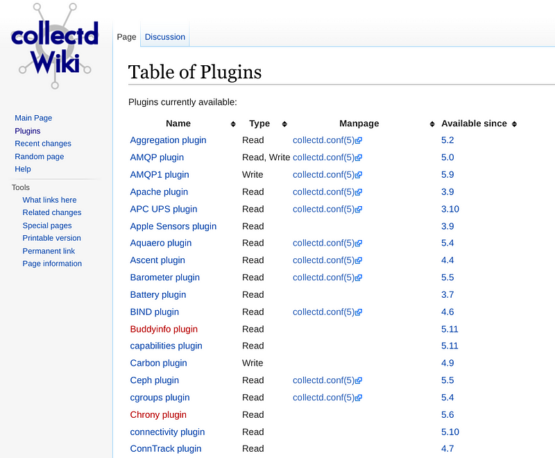
One of the amazing thing about Collectd was the amount of plugins that were available. The downside was to get a recent version you had to compile yourself. Because they were in C/C++ you had to endure 3rd party library/header configure prefix hell.
But it worked, well until the plugin overloaded the server like it did for the Haproxy (or was it Nginx) frontends when we were testing the Elder Scrolls Online announcment site in 2013. We disabled that one, but not the last time Collectd took down a server unfortunately. Fear of agents is real.
Thankfully most modern monitoring tools are written in Golang these days with a single binary and frequent releases for most architectures and operating systems and processsors.
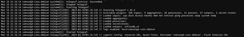
Telegraf is like that. If you don’t believe me look below.
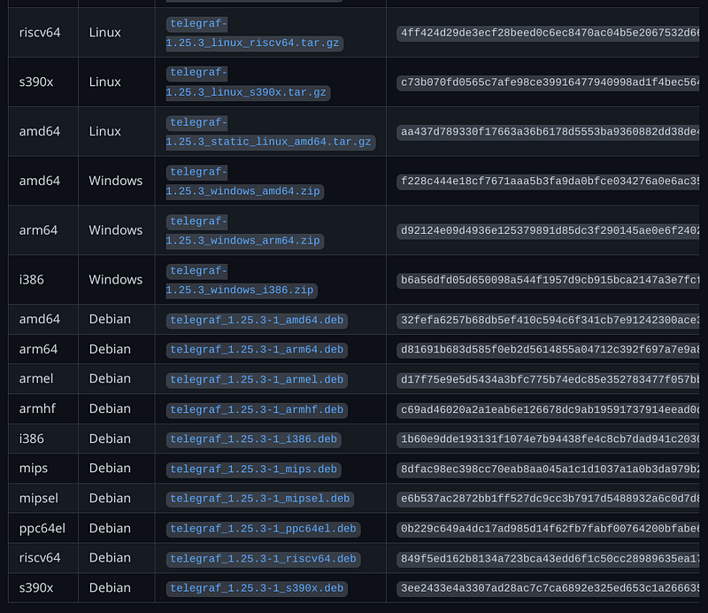
I’ve run on all Linux ARM architectures (arm64, armel, armhf) Windows, and FreeBSD. And of course Intel (at least amd64 and probably i386).
But the real reason is the plugins!
This is what you look for when you restart to know you didn’t screw up the plugin TOML. Yeah, I hope you like TOML.
The Metrics
Enough of the backstory, what are the basic things to keep a reasonably active home network for a family of 5 with 2 XBox’s, 2 Gaming PC’s and pretty heavy users that complain when the “Internet is slow.”
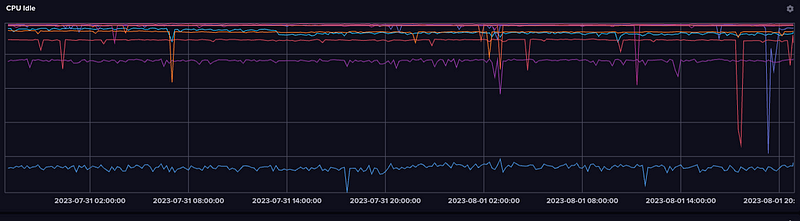
CPU
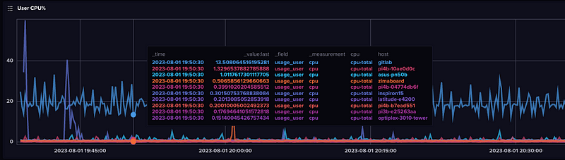
CPU (User, System, IRQ) is a baseline metric pretty obvious and useful.
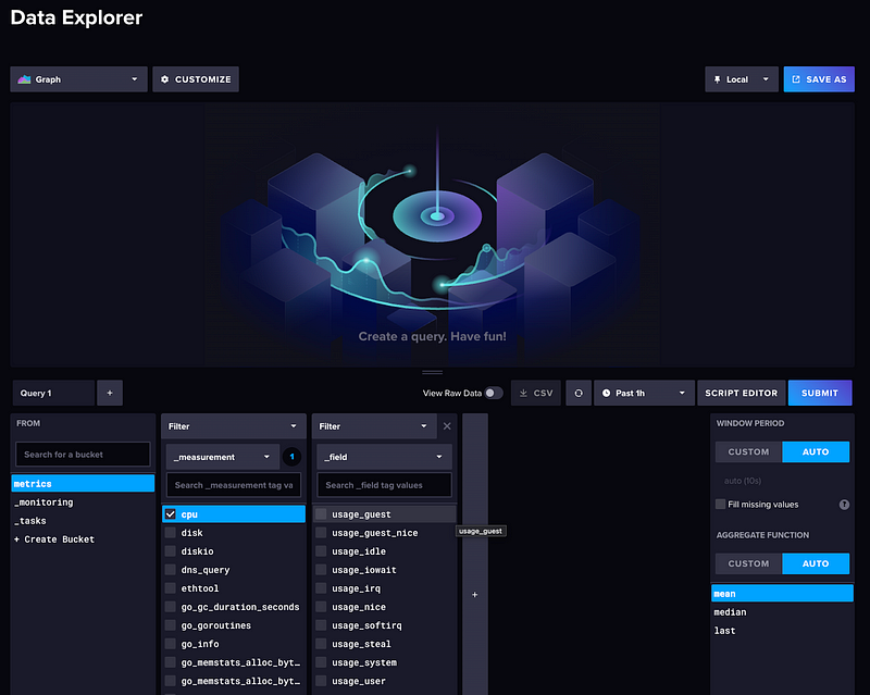
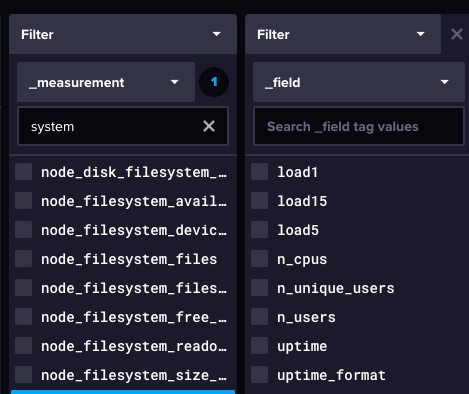
and you can see the various fields available in the Data Explorer
Plotting idle CPU is a nice way to look at the same data based on the assumption that most of your systems (or at least mine) are idle most of the time and to look for the dip.
System
System includes load, users, and uptime, which is nice to see which systems you login into occasionally. Classic Linux stuff. Telegraf does do it’s best to pull back metrics on Windows.
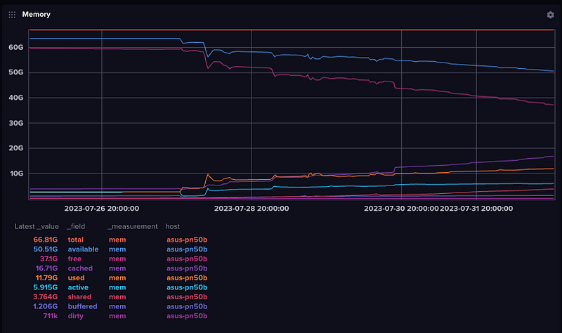
Memory
This is my Asus PN50 with 64GB, though I bought to run DuckDB.
Containers
I don’t have this configured anywhere at the moment but the plugin documentation does a nice job showing you you monitor containers and CPU utilization of Docker containers.
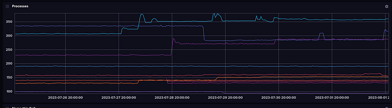
Processes
The easiest and most simple process monitoring allows you to see number of processes, processes in a given state (running, stopped, sleeping, etc.) and threads. There is more advanced configuration that can be used to get CPU and memory utilization of individual processes (collectd did this as well) but I don’t actually use that at the moment.
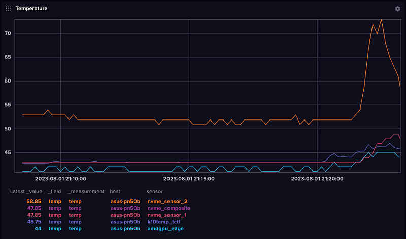
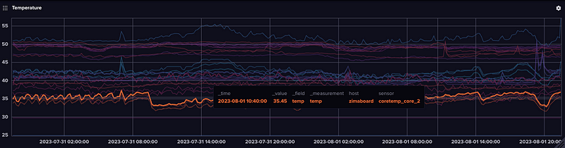
Temperature
Most modern PCs, laptops, as well as embedded devices like Jetson Nanos, Raspberry Pi’s or other devices now have temperature sensors — or multiple sensors. On my PN50, the NVM device is consistently the hottest and you can see it spike when I updated packages last night.
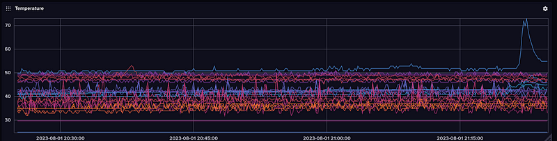
And if we compare this to all the other systems over the last hour, you can see it as the immediate outlier.
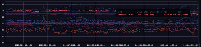
If you zoom out you’ll start to see the impact of room temperature.
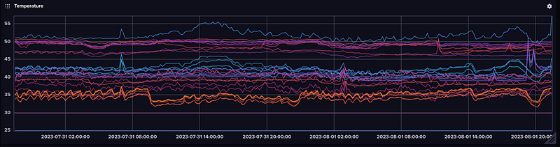
And we can see the Pi4B running InfluxDB is on the warmer side. Even with Argo Fan.
And the Zimaboard, with its massive heatsink (despite being fanless) is on the cooler end
TCP Connection Stats
Not at a lot of commerical tools track this but I remember when we launched the ESO website, we were moniting this with Graphite and Collectd across the 100+ Nginx webservers across the 3 regions.
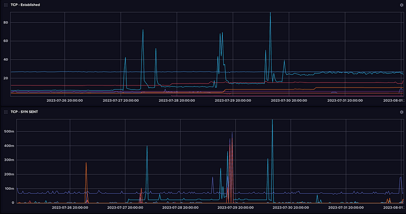
Kids these days probably don’t know all these (not like I remember what they mean, either) but back in the day these are the sorts of stats you monitored for various TCP resource exhaustion attacks.
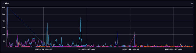
Ping Latency
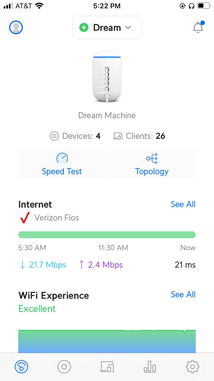
One of the most valuable features I’ve found (especially if you have kids complaining about slow wireless is monitoring the latency from different locations, wired and wireless. And now since I have both Tmobile and Verizon Internet, comparing the two.
[[inputs.ping]]
   urls = ["google.com","verizon.net","tmobile.com"]
My Zimaboard (plugged into the wired port on the TMobile 5G Router) will have the highest latency to Verizon, where some of my Desktops down the basement directly plugged into the Ubiquiti via Ethernet will have the lowest.
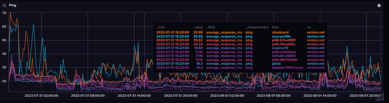
If I zooom out 30 days I can see when I was doing maintenance or had outages!
Various Apps
Over the years I’ve used Telegraf application statistics such as Redis, NATS, and RabbitMQ all in a single binary!